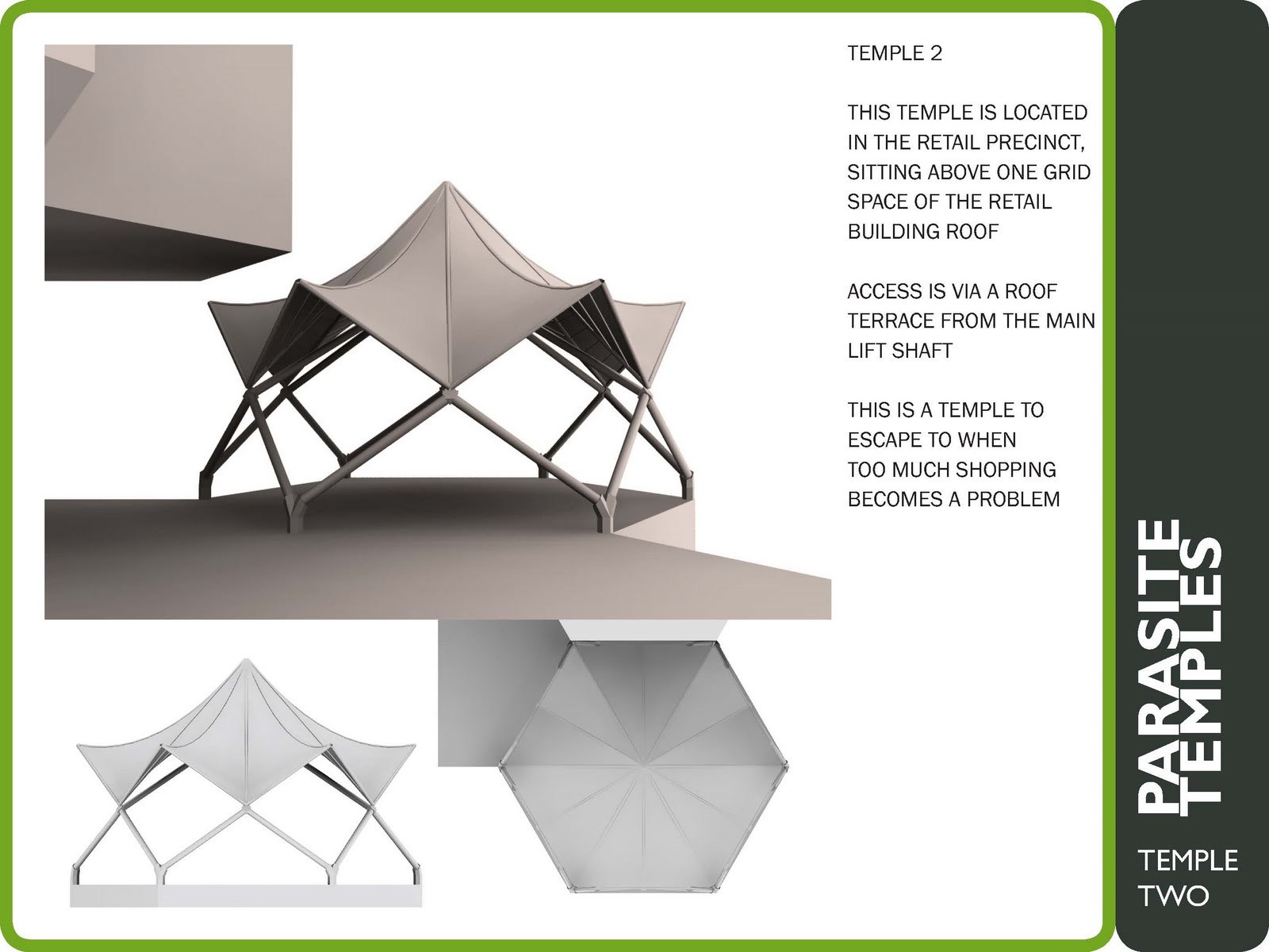
I decided to try some renders instead of physical models as I wanted to look more at the materials and the context. Below are renders of temples 2 and 5. I had a bit of trouble with materials and spent too much time trying to get the bamboo right, which I couldn't really get to work at all, I couldn't get the UV maps to line up or get the right scales. I had also planned to work more some of the details as I had talked about previously but didn't get time in the end.
For the final presentation since I hadn't changed my design I have just kept the previous presentation slides and added in these renders.
Showing posts with label presentation. Show all posts
10 June 2010
06 June 2010
Presentation Week 13
The images of my presentation from week 13 that I forgot to post here.
I would have liked to at least made models of Temple 2 and Temple 5. I am going to think of why I am making a model first before I try again.
24 May 2010
Modeling
I took a day off work today to get the computer modeling done since the drawing for Tech 2 took me longer than expected.
I have chosen 6 concepts from the 20-something that I generated and am working on modeling them in more detail for the presentation. Once I get the first one done it will go pretty quickly as they are all based on the same components. There is also a lot of radial arrays in the model so I generally just have to model one section and rotate it another 5 times.
I am using paper tubes for the skeleton similar to Shigeru Ban's paper designs. I have made a wooden block out of a truncated equilateral tetrahedron (I think that's what it's called) which the paper tubes are joined to with a metal rood going down the centre connecting them. The roof was going to be similar but that may change. I like the detail of a roof Richard Rogers did for an airport, which I may incorporate into my designs.
Having read through the handout Ruwan gave us on presentations I also chose some sentences to sum up my design before I got too much into the details of my concepts. It actually did help me in that I have been refering to these sentences as I have been designing the details.
Image below shows the detail of the joining block. Also the Richard Rogers roof. A bit of chamfer will make the block detail look good but I think I remember there being an easy way to do that in Max.
(our dog is OK now, she gets the bandage off on Thursday)
I have chosen 6 concepts from the 20-something that I generated and am working on modeling them in more detail for the presentation. Once I get the first one done it will go pretty quickly as they are all based on the same components. There is also a lot of radial arrays in the model so I generally just have to model one section and rotate it another 5 times.
I am using paper tubes for the skeleton similar to Shigeru Ban's paper designs. I have made a wooden block out of a truncated equilateral tetrahedron (I think that's what it's called) which the paper tubes are joined to with a metal rood going down the centre connecting them. The roof was going to be similar but that may change. I like the detail of a roof Richard Rogers did for an airport, which I may incorporate into my designs.
Having read through the handout Ruwan gave us on presentations I also chose some sentences to sum up my design before I got too much into the details of my concepts. It actually did help me in that I have been refering to these sentences as I have been designing the details.
The temple design uses different arrangements of a modular system of parts to create concepts appropriate to different situations and contexts. (create join design, glazing, solid panels)I have also been thinking about the presentation layout. For the first page I will have all of the concepts shown in isometric in a grid, kind of like that image keeps coming up of the designs for Parc la Villette. Then each page after will be dedicated to a different concept, the hero image being a rendering showing the design in context. I may also have a page for the different modules that make up the design, not too sure yet as I'm still thinking about what I will put on the slides.
Each design reflects a response to it's unique situation. (choose other designs and finalise)
The temples provide a calm, tranquil space for residents of para/site, whatever district they may be in, to meditate or sit quietly in.
The materials used in the concepts reflect the need of users for a serene quiet environment. (paper/bamboo, roof - ?timber, bamboo, leaf, )
Each temple fits within only one gride space, taking up minimal room.
The temples provide a space free of distractions from life outside. (minimal interior, views only of river, etc)
Image below shows the detail of the joining block. Also the Richard Rogers roof. A bit of chamfer will make the block detail look good but I think I remember there being an easy way to do that in Max.
(our dog is OK now, she gets the bandage off on Thursday)
23 April 2010
Interim Presentation
My presentation boards for the interim presentation yesterday.
1. Inspirations for my design. From the lotus flower, a common symbol in Buddhism as it grows from the mud but becomes a beautiful flower. This influenced the form of my design. The 8 sided wheel, another symbol, also influenced the design.
Temples on Hua Shan. The temples are perched on top of the mountain, above the dust and distractions of life below.
Chinese architecture. The structural systems of columns and dougong influenced my design. I interpreted these using digital design tools like TopMod and Rhino to create tessellated and folded shapes. The roof was also important in the way it protects the structure but also allows light to enter by turning the end of the eaves up.
2. A quick rendering my of concept design. The columns and dougong were created in TopMod and arranged in Rhino. These can be made using tessellation. The roof was created in Rhino. Folding the roof and using this form allowed the eaves to be upturned.
The design sits on legs and is perched on top of the grid structure. I'm not too sure how the grid works yet though, is it horizontal or vertical? Either way should work with my design.
3. An interior view. Windows direct the view away from the rest of the grid to give the feeling of being away from life below. Seating is built around te structure and meditation is done on the floor. I might introduce a screen on top of the stairs to block the view through the door.
Workers or students can ascend the grid and meditate in the hall during lunch or after hours.
4. An exploded view of the concept. A folding roof. Upwards facing windows. A skeleton structure. The floor.
5. A elevation of the concept. The legs folding in to sit above the grid gives the impression of a parasite.
6. The floor plan. A simple layout. I would still like to work on the clearance under the arches when climbing the stairs. I tested it and a person can walk under them but there is not much extra clearance.
1. Inspirations for my design. From the lotus flower, a common symbol in Buddhism as it grows from the mud but becomes a beautiful flower. This influenced the form of my design. The 8 sided wheel, another symbol, also influenced the design.
Temples on Hua Shan. The temples are perched on top of the mountain, above the dust and distractions of life below.
Chinese architecture. The structural systems of columns and dougong influenced my design. I interpreted these using digital design tools like TopMod and Rhino to create tessellated and folded shapes. The roof was also important in the way it protects the structure but also allows light to enter by turning the end of the eaves up.
2. A quick rendering my of concept design. The columns and dougong were created in TopMod and arranged in Rhino. These can be made using tessellation. The roof was created in Rhino. Folding the roof and using this form allowed the eaves to be upturned.
The design sits on legs and is perched on top of the grid structure. I'm not too sure how the grid works yet though, is it horizontal or vertical? Either way should work with my design.
3. An interior view. Windows direct the view away from the rest of the grid to give the feeling of being away from life below. Seating is built around te structure and meditation is done on the floor. I might introduce a screen on top of the stairs to block the view through the door.
Workers or students can ascend the grid and meditate in the hall during lunch or after hours.
4. An exploded view of the concept. A folding roof. Upwards facing windows. A skeleton structure. The floor.
5. A elevation of the concept. The legs folding in to sit above the grid gives the impression of a parasite.
6. The floor plan. A simple layout. I would still like to work on the clearance under the arches when climbing the stairs. I tested it and a person can walk under them but there is not much extra clearance.
15 March 2010
Subscribe to:
Posts (Atom)